Thursday 27 September 2012

Audience Research 2

Analysis of results from questionnaire:
From the 23 responses I received back: 17 were female, and the remaining 5 were male, this may indicate the type of target audience we want to attract.

As the majority of an answers received were from the age demographic of 17-19, this supports the target audience I want to attract for my music video.

As a result of over half the responses preferring the genre of indie-rock, this means that the following answers will have more meaning and knowledge behind them, as they are from people who are interested in the genre. It also implies that my group and I must ensure that all the conventions of the genre are followed, as they are what people want to see.

From these questions so far, the following profile for the target audience can be made:


From the answers gathered of this question, it can help my group and I when it comes to creating the advertisement for the CD; most people said that the radio was the main source of finding out the latest music, so this suggests that on the advertisement, we should include when the first air-play will be, an interview, etc. Following this, is YouTube, so this may indicate that on the advertisement, we should include when its songs premiere will be.

 Like the previous question, this suggests that within the album advertisement, we should include when it goes on sale on iTunes - as this was the main answer given from the respondents, and also when it goes on sale within shops.


 As the answers for this question appears divided between: a narrative where the lead singer is the central character, and a performance in which the artist/band are singing to the camera, this hints to me that my group should involve cross-cutting in the video; cuts from a narrative, to shots of the artist performing - like what is seen in 'The Man Who Can't Be Moved' - The Script.


These results show that the recipients of the survey prefer to see editing in which the cuts occur on the beat, as well as fast-paced editing. As a result of cutting on the beat, this would allow the pace of editing to sync with the pace of music - allowing the video to appear smooth; editing appears subtle. However, the use of fast-paced editing could be used when the song reaches it climax, giving off an energetic and entertaining experience to the videos viewers.  

The responses also summed up what should be expected from an 'Indie-Rock' music video, therefore informing us on what should definitely be included in our video:
- Low-key lighting, and maybe the use of spot-lights
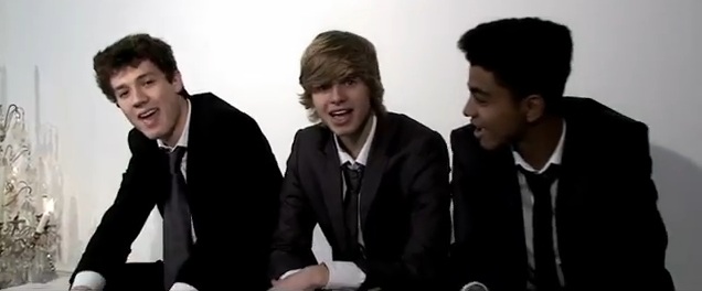
- Dark, smart clothing, but should look casual
- Locations that are appropriate to the meaning of the song, that also fit its tone
- Props should be revolved around the instruments
- Based around individuality and originality
- Effects such as slow motion
- Close-up for lip-syncing, long shots to show the entire band and instruments
- Muted colours

From this, the predominate answer was that the artist be on the front cover, however, the idea of an abstract image on the cover was also popular, so we could still follow through with what people want, but instead have an abstract image on the back. This way, our CD cover would include numerous features that people expect from an album cover.

The answers about what conventions people want to see on a CD cover will act as a guide for me and my group, so that we can ensure all the elements are included:
- Cover that portrays the personality of the band
- Desaturated colours
 - Track-list
- Image of band-members, so that they are easily recognisable
- Big, bold font which stands out to the public
- The band and record labels wesbite
- A vibe needs to be given off from the CD which will tell the public what the music will be like


As a result of people wanting there to be similarities between both the CD cover and the CD advertisement, this inserts an element of consistency throughout the layout and themes, which therefore, would allow the promotional material and the album to be easily recognisable, and would relate to each other.

The answers based around the conventions for an advertisement prove to us exactly what people want to see from an album promotion, this included:
- An interesting image to attract attention
- Release date
- Where the album is available from
- Background should suit/relate to the genre or band
- Bold font displaying the album title and artists name
- Low-key lighting
- Possible tour dates

By taking all of the answers into consideration, by analysing and evaluating the results, it will enable my group to produce the best music video possible, as we will be following both the conventions of the genre, and what people want to see from a video, album cover, and advertisement from this genre, meaning we will target our audience as best as we can.

Tuesday 25 September 2012

Audience Research 1

The survey my group and I created on Google Docs about research into our chosen genre of indie-rock:


This survey created on Google Docs, asks the recipients their demographic, interests, and what they expect to see from an indie-rock video, CD cover, and album advertisement. 

As our group sent it to people in our year group, we expect the gender demographic to be varied, while the age demographic is predicted to be between 17-19, with a few being 24+, due to sending it to teachers, in order to see their opinions from a different age range. We hope that recipients will describe in detail their expectations of a music video, CD cover, and advertisement, as this will help us when it comes to analysis of the research, and also when making our music video. Their replies will inform us of what people want from this genre, enabling us to include this in our video, so that it is conventional and appropriate for the genre.

Monday 24 September 2012

Advertisement Research

'Sigh No More' - Mumford and Sons:

'X & Y' - Coldplay:

'To Lose My Life...' - White Lies:

Conventions seen throughout the genre:
- Dark colours are included, with stark colours contrasts.
- The band name and album title are displayed in bold letters, that stand out amongst the background.
- Either an image of the band, or the album artwork is the central focus of an advertisement.
- Record labels are credited at the bottom of the advert, as part of the promotion.
- Further information about the band and their songs are given; part of the track list is provided, the release date for the CD is given, and their website is shown.
- Reviews showing the potential and praise for the album may be incorporated in order to persuade the public further.

Sunday 23 September 2012

Thursday 20 September 2012

CD Cover Research

'Slipway Fires' - Razorlight:
This album features the use of spotlights, meaning each band-member has been highlighted to viewers, and their attention is drawn; the artists stand out ammongst the black background of the album cover. A dark background is conventional for this genre, as well as the other colours seen on this album cover, such as: red and dark blue. The band-members are displayed in mid close-ups, and are wearing a mixture of costumes; some appear smart, while other appear more casual. Also, the back cover of the album features the usual conventions of an album: an image of a band-member (in this case, the guitarist), the track-list, a barcode, the record labels, a mixture of colours (on this album cover, they match the conventions of the genre: dark colours), and a spine for the cover.

'Elephant' - The White Stripes:
This album features low-key lighting, as shadows are generated, and the band-members are emphasised by the use of spotlight.
Convetional colours are used: black and red. Their costumes however, seem a little obscure - maybe they're taking on fictional roles for a narrative. A long shot is used, in order to show the band together. The back cover of the album also follows the conventions: barcode, spine for the album, a tracklist, record labels, and typical colours for the genre.


'Started A Fire' - One Night Only:
This album cover is a long shot of the band, wearing conventional indie clothing: smart yet casual, long hair, plimsoles, etc. Low-key lighting is used, which creates shadows of the artists. They appear to be in quite an eerie and isolated location, while the dark colours of their clothing allow the band to standout from the white background. Usual colours are included; red is used for the title of the album. However, the reverse side of the album displays a tracklist, and the record label.

An example of an ablum from this genre that goes against the conventions is 'Babel' - Mumford and Sons:
Unlike other albums from this genre, this album features high-key lighting, bright and calm colours: yellow, white, etc. Their clothing is more smart than casual. In the background of the image, the band appear to be surrounded by an energetic and lively atmosphere - which isn't normally seen on an indie-rock album cover, therefore this album breaks away from what is typically seen.


Genre Research 3

The conventions for a music video in the indie-rock genre are listed below:

Click on image of the brainstorm below in order to enlarge:


Examples of each convention:
- Close-ups of band-members and their instruments, followed by long shots of the whole band, can be seen in 'If You Wanna' - The Vaccines:


- A narrative which cross-cuts to performance, can be seen in 'Tonight's The Kind of Night' - Noah and The Whale. This also shows the change in location that is seen in indie-rock videos:


- The low-key lighting convention is seen in 'Techo Fan' - The Wombats:

- The muted colours in this genre of music can be seen in 'Chocolate' - Snow Patrol:


- The smart, casual clothing conventions for the indie-rock genre is seen in 'Somebody Told Me' - The Killers:

Genre Research 2

Analysis of 5 videos from my chosen genre:

'Little Lion Man' - Mumford and Sons:

'Chelsea Dagger' - The Fratellis:

'Life Goes On' - Noah and The Whale:

'Never Say Never' - The Fray:
(Click on brainstorm in order to enlarge) 


'Runaways' - The Killers:

Monday 17 September 2012

Genre Research

Below is a mood board of what I think the image of the 'Indie Rock' genre is:
From this, I think the artists of this genre want to be presented as casual, yet fun. Their costumes are usually suits, however they appear both smart and laid-back in their appearance. It seems that when the artists associated with this genre perform gigs, it appears as quite an intimate setting, however when performing in a festival, it changes to become quite energetic and lively. Instruments included within this genre are always shown within a music video; close-ups of the guitar/drums are frequently seen. The colours are quite pale - they're not vibrant like those that would be seen in other genres, such as: pop. The use of lighting, and whether it is high or low-key usually depends on the mood of the song, as many videos of this genre vary in their appearance. The setting of the music videos will change, as within the music video, multiple shots of different locations will be seen.

Friday 14 September 2012

Low Budget Ideas

From watching the low budget videos below, there are practical tips that can be learnt from them, and what I should consider when I film my own music video, including:

- They use close-ups and mid close-ups of individuals singing, which are then followed by mid-shots/long shots of either them with their band - as seen in 'The Fix's' video - or them and their surroundings - as seen in 'Imogen Heap's' video.


- Pace of editing matches the tempo of the music; when the beat of the music changes, the music video cuts to a different shot.

- Costumes, props, and locations are appropriate to the song and genre; all members of 'The Fix' wear matching outfits to show they are a unit, and the video cuts between suitable locations. While the video for 'Imogen Heap' includes quite dark clothing, in order to match with the mood of the song, and uses locations that appear eerie - which is helped by the use of effects that have been edited in.


- Where appropraite, effects are used, especially in 'Imogen Heap'; the effects create a dazed, creepy, and mysterious atmosphere - which matches the sound of the music.


- Framing of the shots throughout the video ensures the videos look professional.

- They incorporate a dance sequence in order to match the conventions of the music's genre.


- The lighting is suitable to the song; 'The Fix' use high-key lighting in order to match their pop song, while 'Imogen Heap' uses low-key lighting to suit the dark and sinister tone.


'A-ha!' - Imogen Heap:


'Just Got Paid' - The Fix: